eSign-Lite & eSign-Mobile
Redesigning digital signing solutions
PROJECT INFO
eSign-Lite
Vizibit’s latest product, eSign-Lite, simplifies digital signing, saves time, reduces paperwork, and secures electronic documents with a digital signature. It seamlessly integrates with web-based systems already used by businesses.
eSign Lite screens before redesign
PROBLEM
The main issue with the app was that the workflow was overly complicated, the process was not user-friendly, there was no consistent design system, and the copy was unclear.
eSign Lite screens before redesign
CHALLANGE
Biggest challenge for us was to offer users two distinct options for signing – with or without a signature image, while also ensuring that selecting signature type was easy and straightforward.
OUR APPROACH – RESEARCH

Competitive Analysis
To make our product more user-friendly and distinctive, we researched other companies that are also simplifying digital signing and examined how their products impact users. Our emphasis was on organizing the main screen and document managment using recognizable design patterns to make it intuitive for users to operate our app.
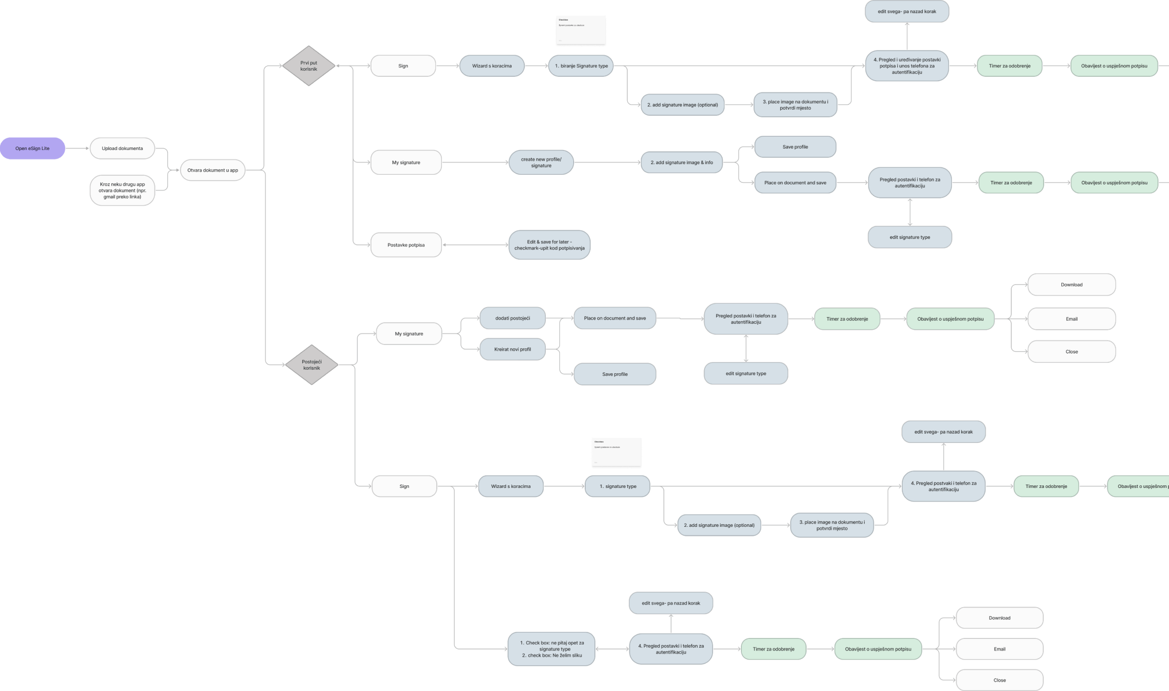
User flow
We conceptualized user flow, and two different paths emerged: signing with and without a signature image. Choosing a signature image, the user is able to choose further options; drawing their signature, uploading signature image and writing a signature with default fonts. This process is longer, and requires more effort. Quick signing without signature image requires choosing certificates and validating your identity through your phone number.
THE SOLUTION
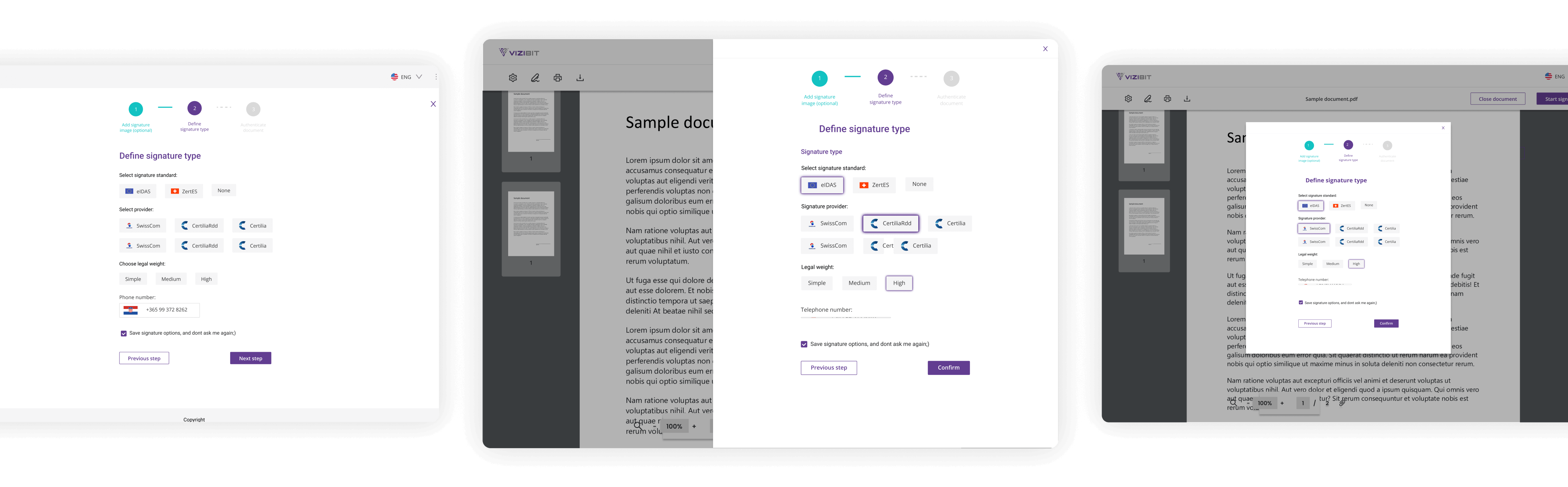
Hi-fi wireframes
Next step was redesigning screen by screen, implementing new user flow.
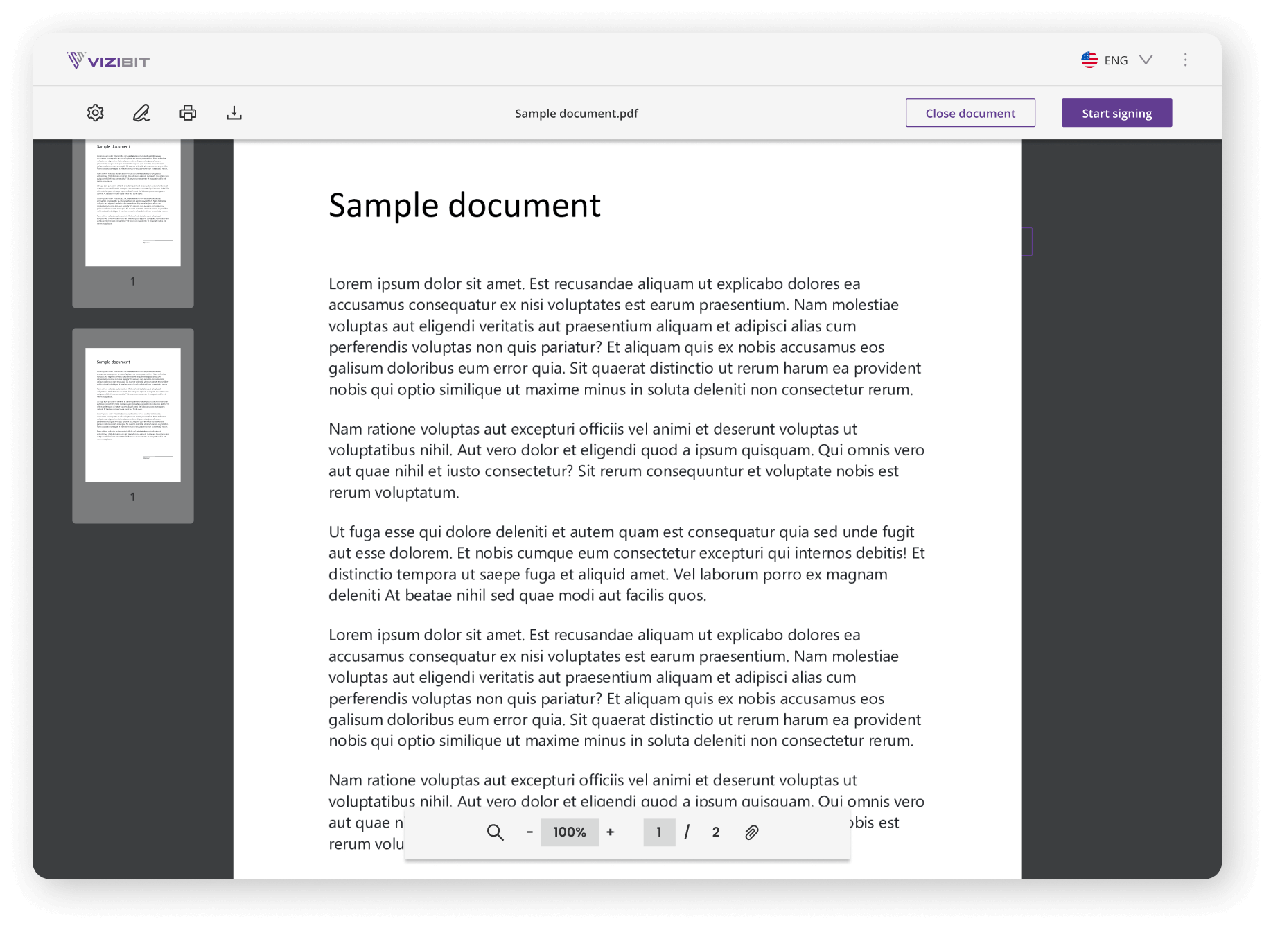
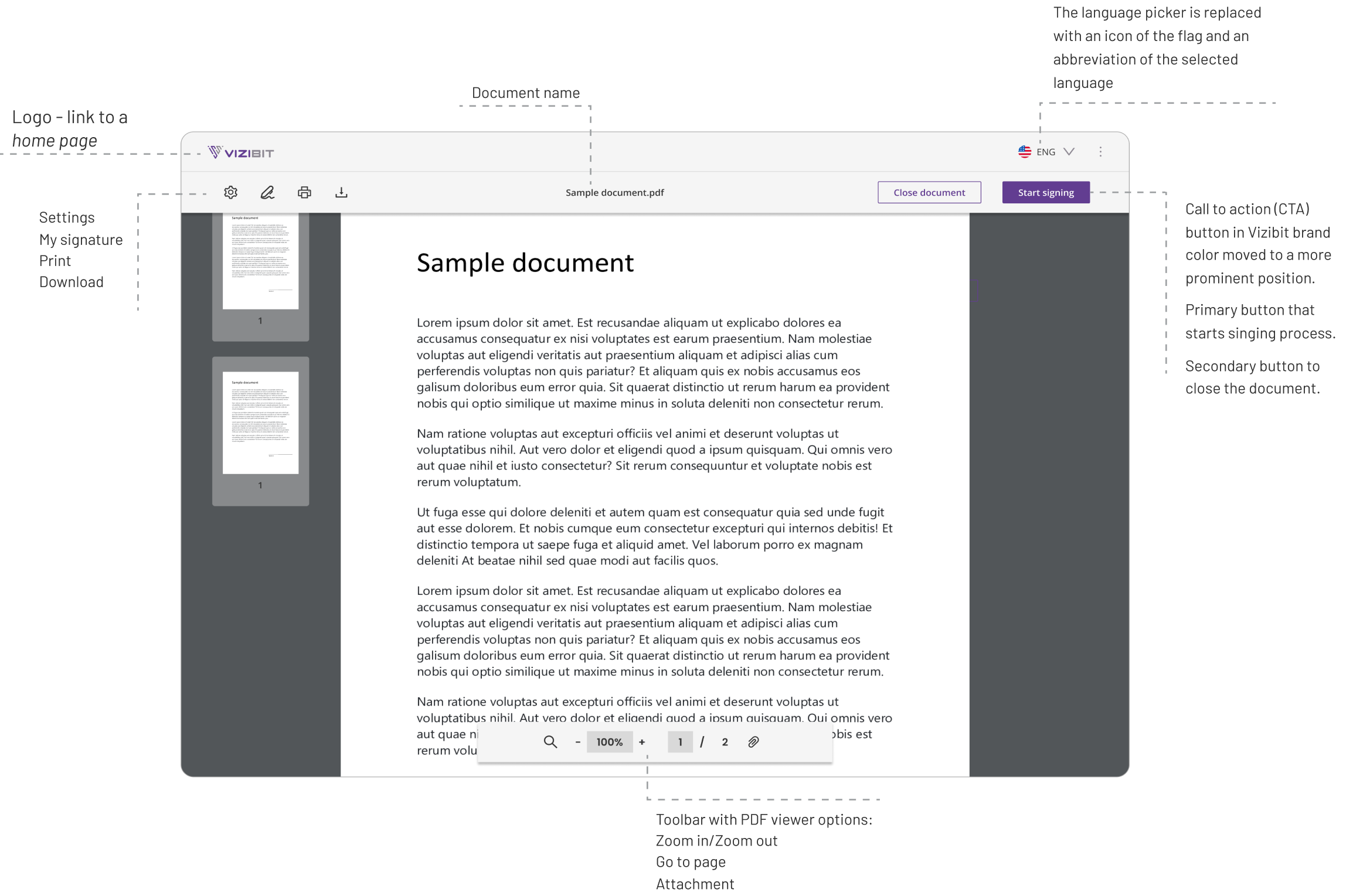
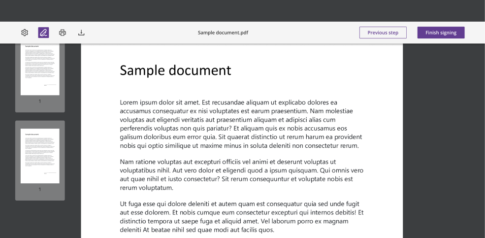
HOME SCREEN
The process of redesigning the home screen started with information architecture, which involved organising various actions into distinct groups. For example, the PDF viewer was placed in a navigation tab at the bottom of the document, while other options were placed in the toolbar in a more logical order. Additionally, a more neutral color scheme featuring shades of gray was implemented to ensure seamless visual integration with the systems that users are using.
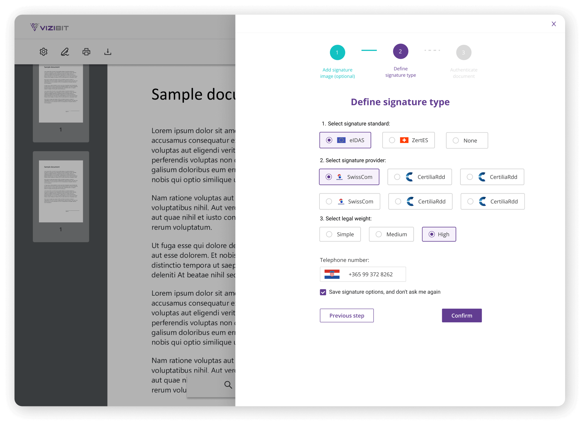
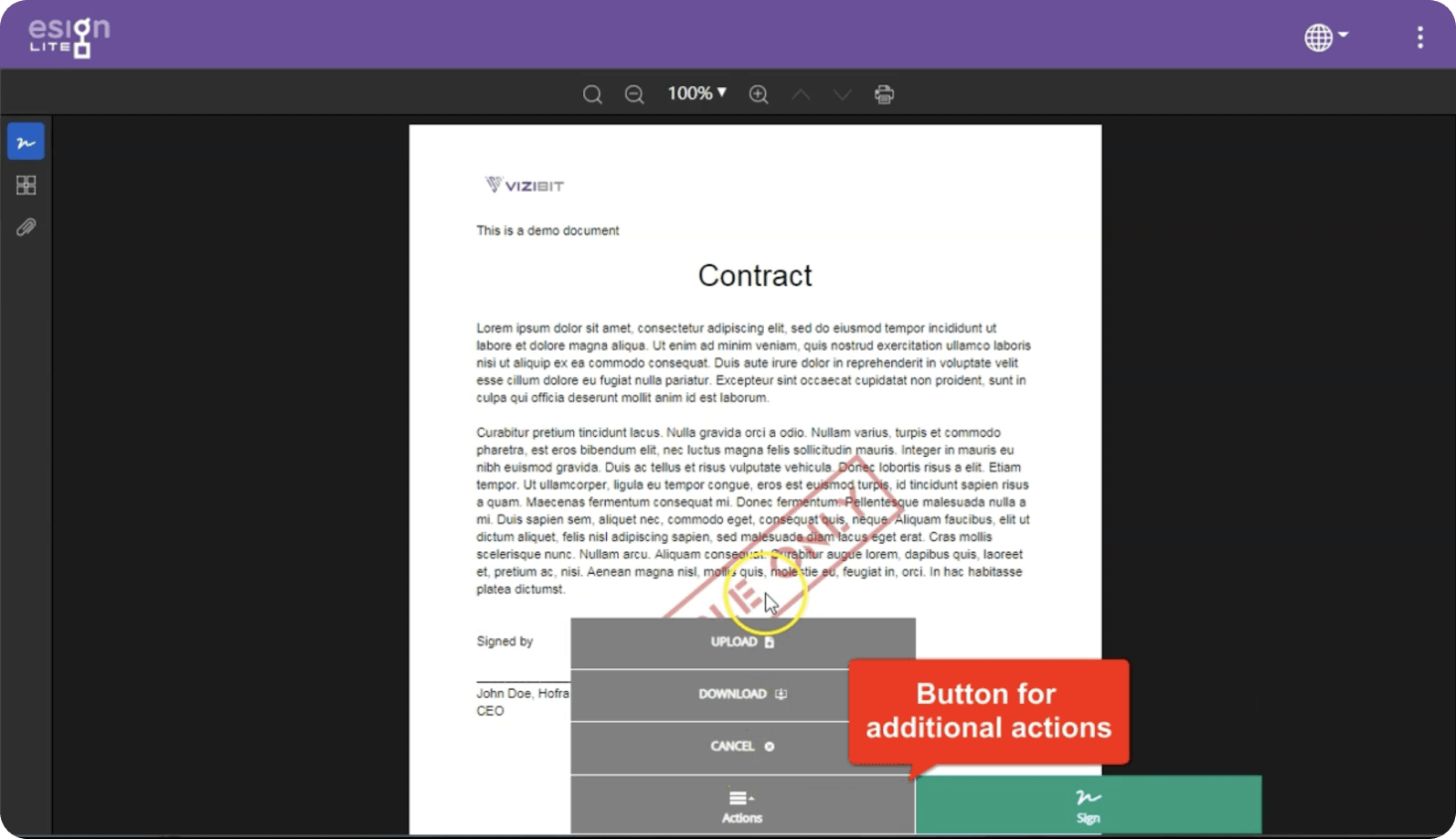
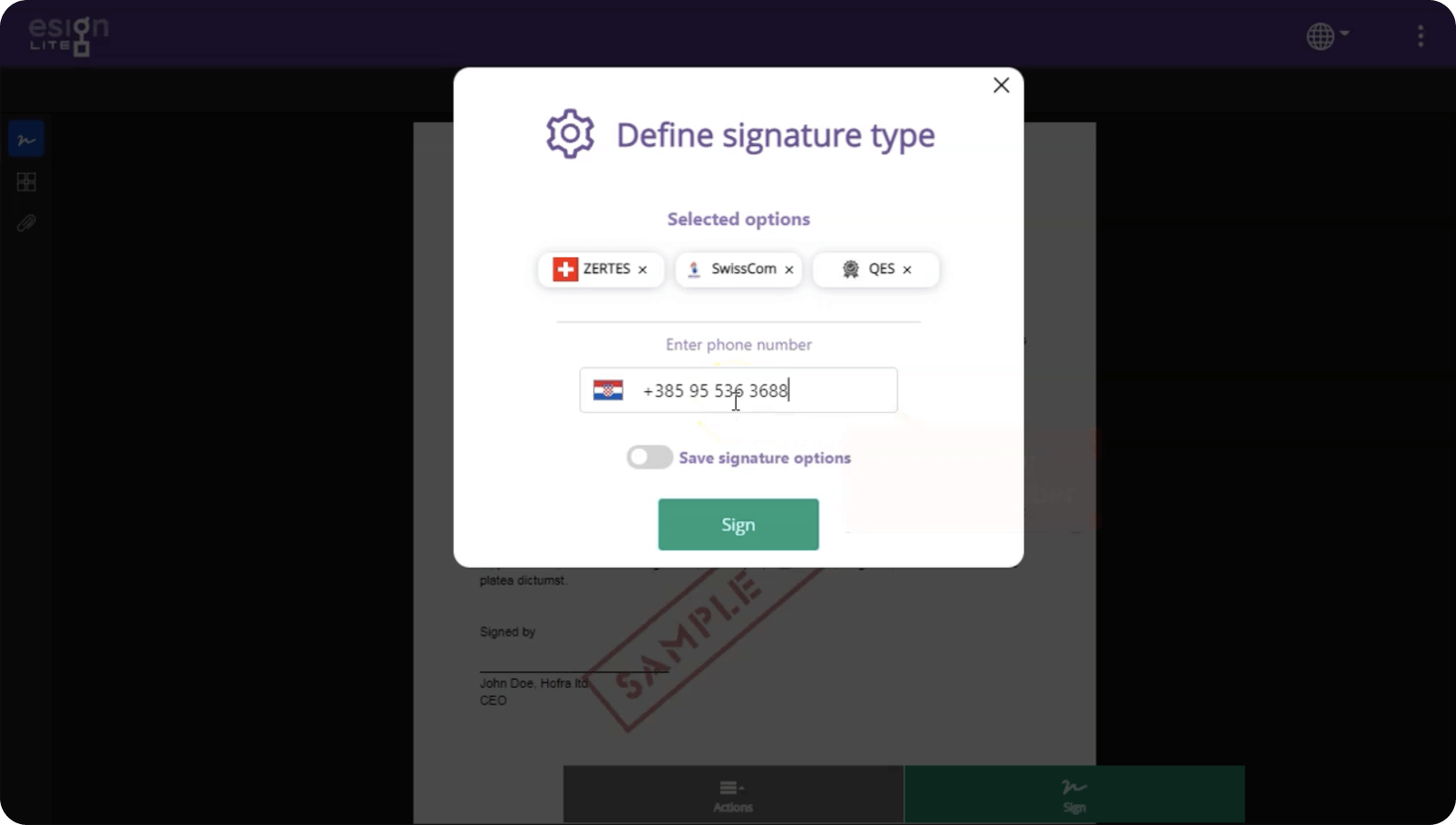
SIGNING WIZARD
The wizard simplifies the completion of complex tasks by breaking them down into smaller, achievable steps, and providing guidance on how to complete each one until the end goal is reached. As a result, the signing process was simplified, and the user’s mental load was reduced.
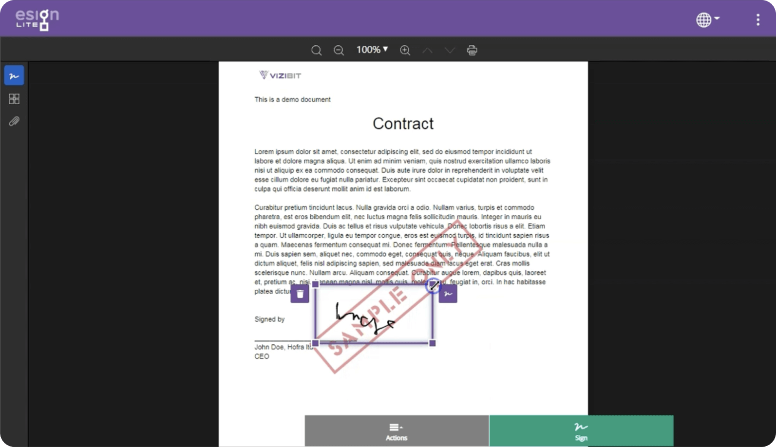
After three iterations of wizard design, the last version of the right drawer was chosen because it achieved a balance between providing enough space for wizard information and allowing for a visible preview of the document.
eSign Lite screens before redesign
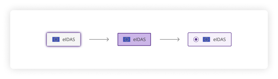
The final version of the wizard was achieved through A/B testing, resulting in a reduced number of steps and a different order of information. Initially, the method of selecting tag buttons was unclear for users, so we improved it by replacing them with radio buttons.
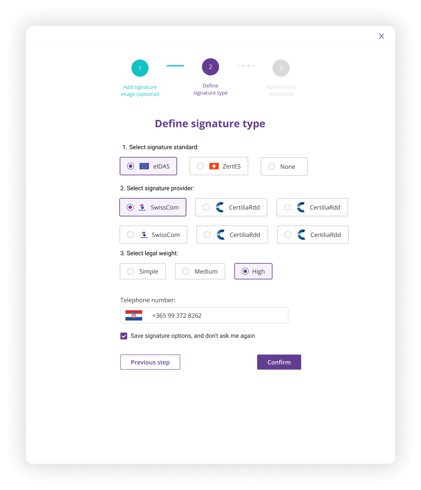
Final version of right drawer
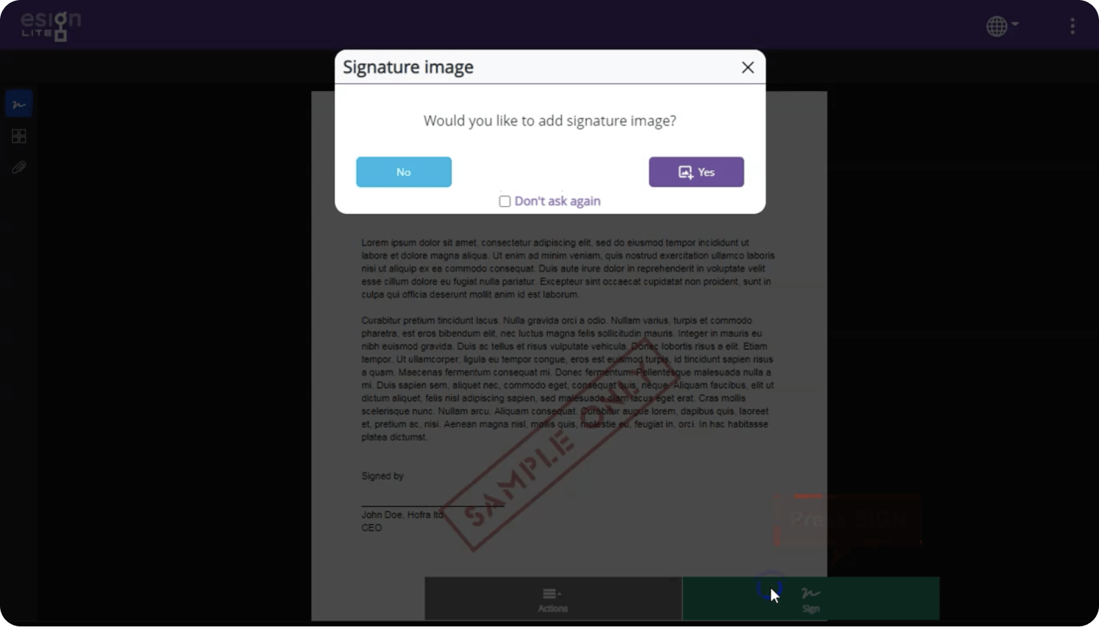
STATUS MESSAGES
In order to keep the user well-informed about the different stages of the process, it was crucial to create status messages, which were enhanced by the use of colors and icons. Additionally, it is essential to provide suggestions on the next action to be taken by the user within the same window.
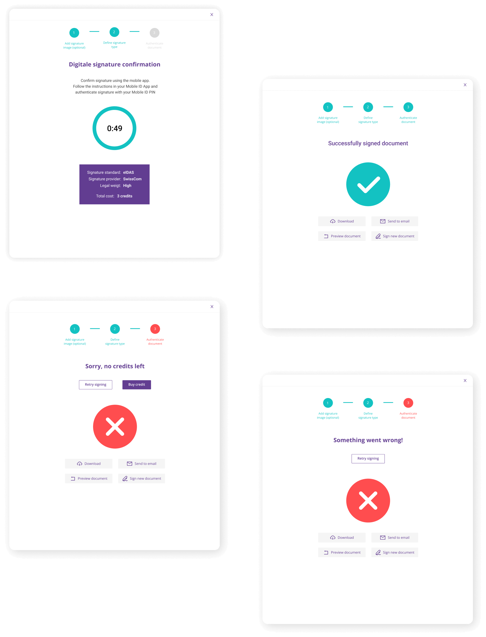
Status messages
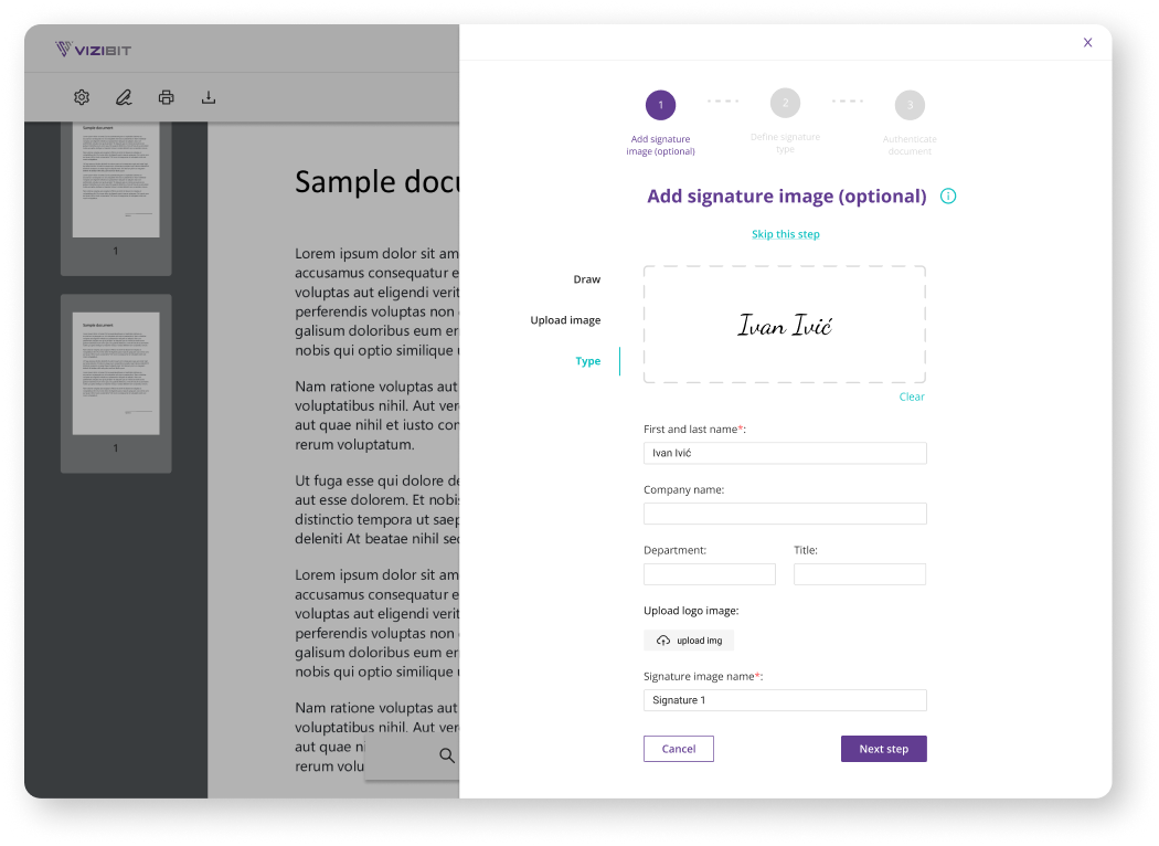
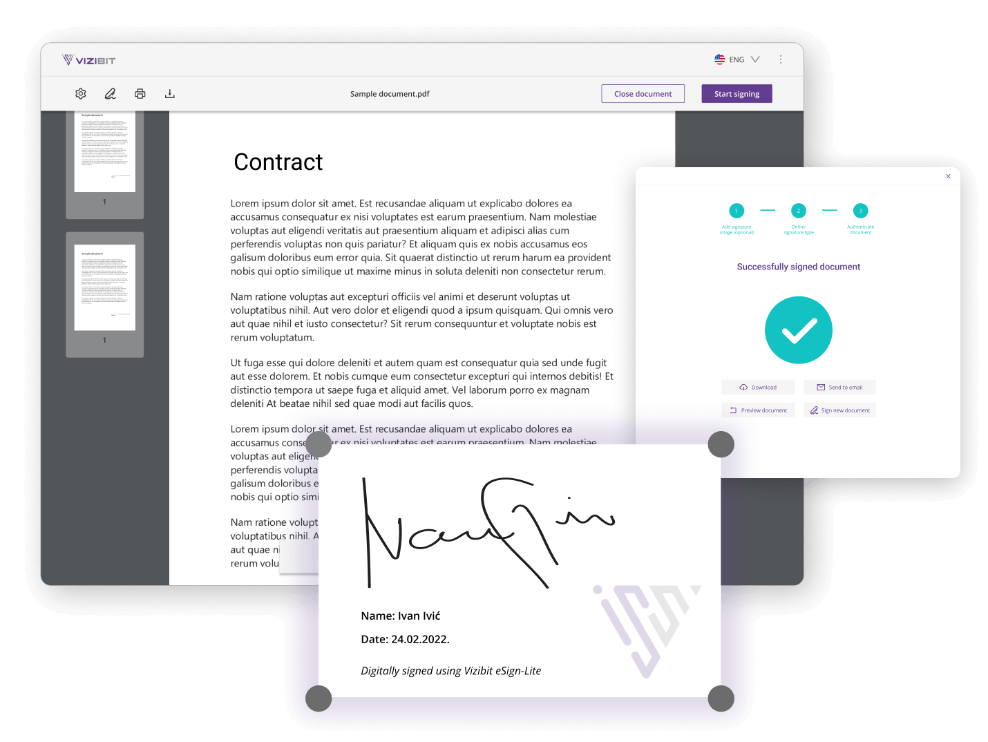
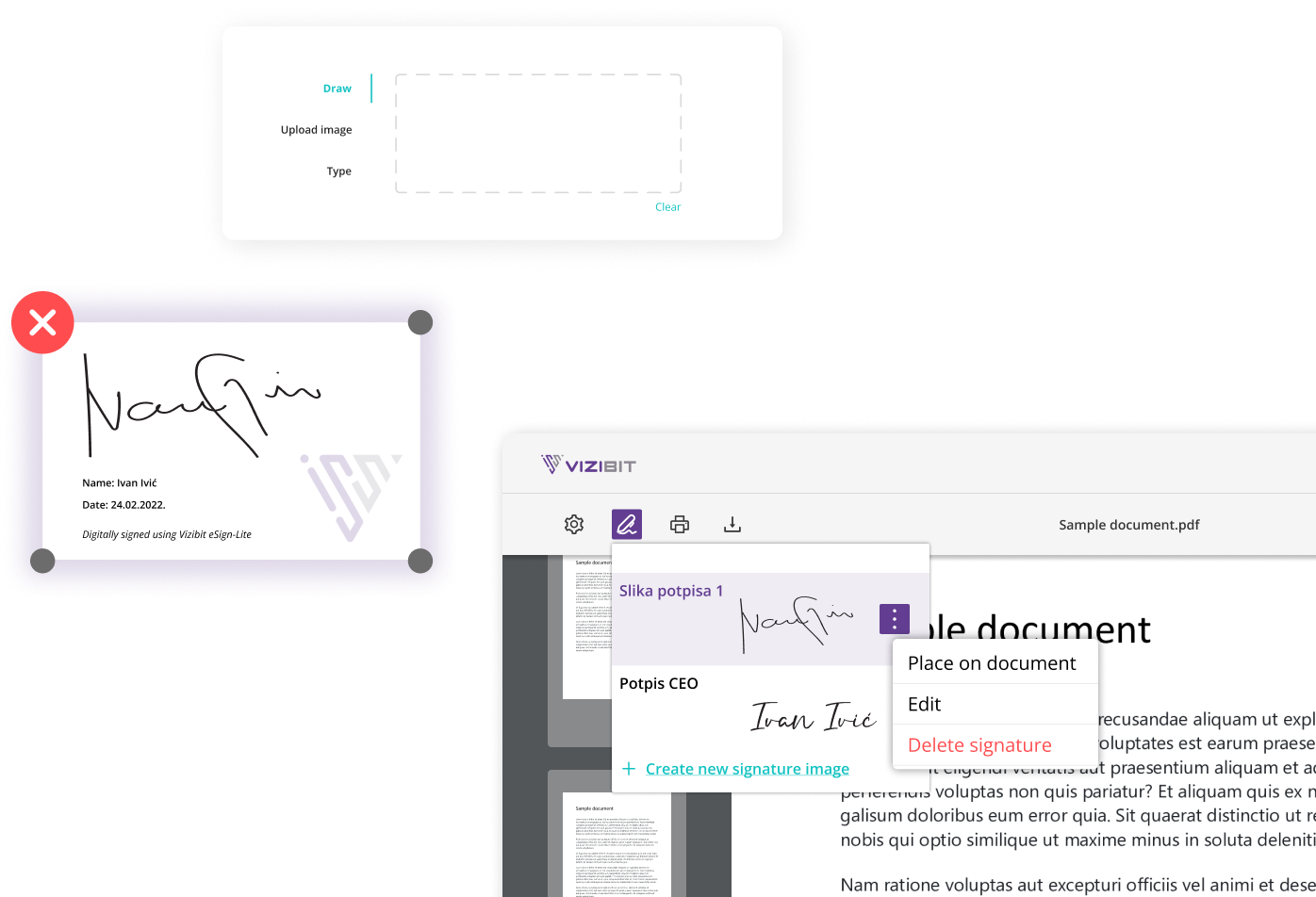
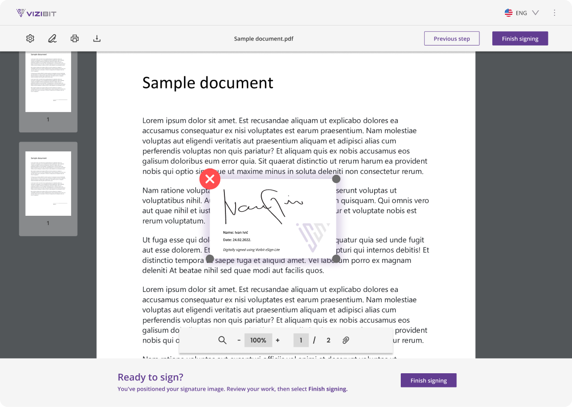
SIGNATURE IMAGE
Adding a signature image on to the document was the most challenging aspect of this project. There are three methods available for adding a new signature image. Each of these options has a dedicated field where users can either draw, type, or upload their signature. Beside that user can input their name, title, department, company logo, and signature image name. After completing these steps, users can preview the entire document and place the signature image in their desired location, which takes them out of the right drawer.
THE CONCLUSION
The results
Redesigned app received positive feedback from users, resulting in reduced complaints and increased adoption rates. Improved intuitiveness and ease of use, along with perceived security and authenticity of digital signatures, were cited as major benefits. The outcomes highlight the crucial role of design in shaping the user experience, emphasizing the need to prioritize user-centered problem-solving and create aesthetically pleasing, user-friendly interfaces.
Next work
A premium coffee beans supplier aimed to revamp its branding, reflecting its dedication to high-quality coffee.
Have a project in mind or want to say hello?
So, if you’re looking for software that not only gets the job done but also looks darn good doing it, look no further than BIT4BYTES! Our team of creative masterminds will help you achieve digital success in style.